
The COVID-19 coronavirus pandemic is continuing to grow, and the Centers for Disease Control (CDC) is ramping up testing to gather more data on the spread of the virus in the U.S.
Gathering data is a must, but unfortunately, the CDC is running into a very common – and very problematic – risk management problem: using qualitative and pseudo-quantitative methods to calculate and communicate risk.
As you can see in the image above, the CDC is still using “High, Medium, Low” methods for communicating risk to the general public. They are using advanced epidemiological simulations that produce probabilistic results, but, unlike what you’ve seen with hurricane forecasts from the National Oceanic and Atmospheric Administration’s National Hurricane Center, any quantitative analysis is reduced to an ordinal scale for public consumption. This is not actionable for most organizations.
Why?
For starters, an ordinal scale like the one above doesn’t rank magnitude, or the degree to which one thing is “more” than another. In this case, exactly how much more exposure or risk does “High” represent over “Medium?” Put another way, if one location has a “High” rating versus a location with a “Medium” rating, how much more likely are you to become infected if you’re in that first location – 5%, 20%, 80%? There’s no proper context.
Another flaw that flows from these kind of ordinal ranking systems is that you can’t perform math with them. It’s easy to see how you can’t exactly add “High” to “Medium” to get any kind of insight. If we used a 5-point scale instead, and one was a 4 and the other was a 2, is the first location twice as risky as the second location? Is a 3 location three times as risky as a 1 location?
Finally, using a “High, Medium, Low” method doesn’t give you what you need the most: the ability to make informed decisions via quantitative analysis. If we wanted to create a model to forecast the spread of the virus and calculate infection rates, we need the actual data – the numbers of potential cases, confirmed cases, deaths, recoveries; the demographics of the patients and of the location as a whole; observed transmission rates, etc. The CDC would be performing a more valuable service if it made that information readily available to the public so that anyone can use it, but unfortunately, they either are restricting what they publish to the public, or the lack of testing to this point (as of Friday, March 13, only roughly 16,600 tests had been performed, or 0.005% of the population ; South Korea, by contrast, has tested 0.45% of its population, or 90 times the per capita amount in the US).
To those who say that the “High, Medium, Low” approach is the best way to inform a large group of people who probably don’t have experience in statistics, we call foul. The National Hurricane Center, as mentioned above, conducts the same probabilistic analysis as the CDC when forecasting the intensity and track of a hurricane. But it doesn’t shy away from numbers; in fact, it produces images like the one below (Figure 1):
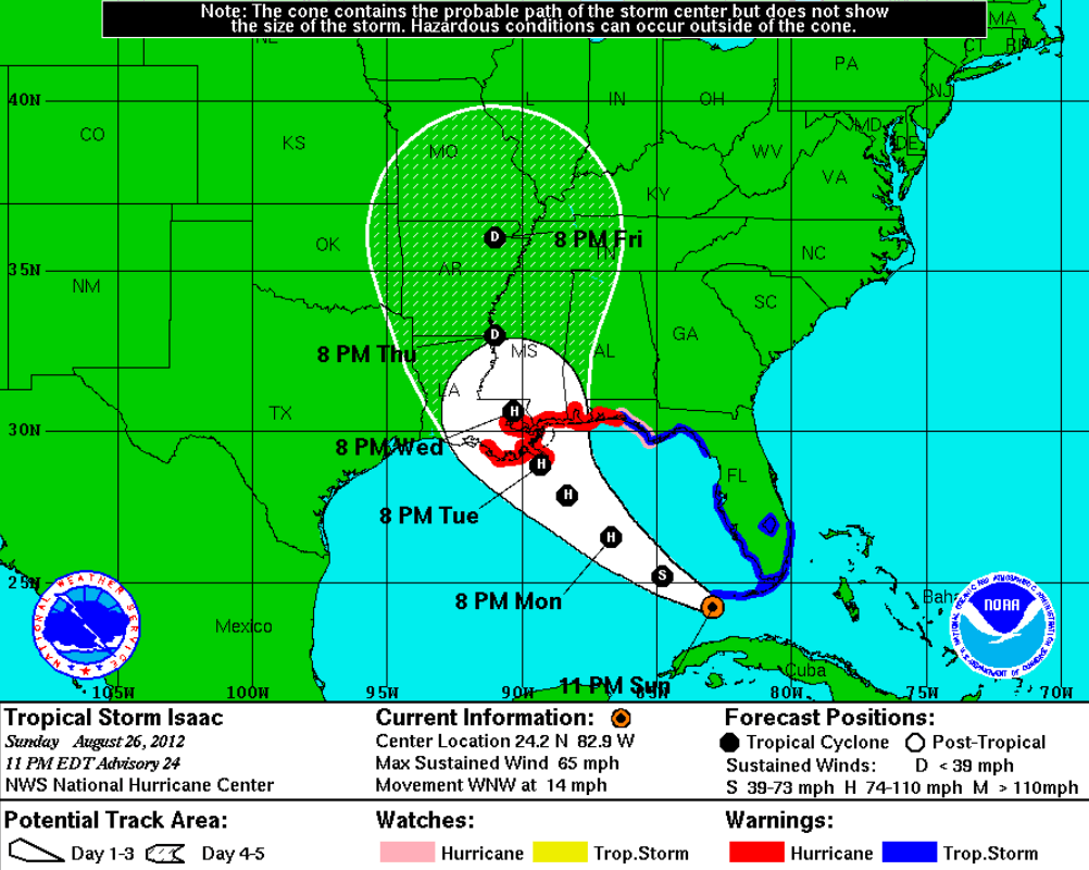
Figure 1: National Hurricane Center’s Projection for Hurricane Isaac, August 26, 2012
Everyone can understand this chart. It doesn’t tell you exactly what will happen, but it doesn’t have to. Instead, someone can look at the chart and see what is most likely to happen, when it’s most likely to occur, and how intense the storm will most likely be. All of those conclusions were drawn from analyzing troves of data about wind speed, humidity, internal pressure measurements, water temperature, and the like, so it’s not as if tracking a hurricane is child’s play compared to calculating infection spread. If the NHC can do it, so can the CDC – and they should.
If government agencies want to adequately convey risk to the public – and to their own internal and external decision-makers – then using qualitative and pseudo-quantitative methods like risk matrices, heat maps, and weighted scoring is insufficient at best and dangerous at worst. If we are all to make better decisions regarding the coronavirus pandemic, then we need better efforts from those who we have entrusted with our safety.
—
Note: The above concepts are explained more completely in The Failure of Risk Management, which can be purchased online here.

Get a more granular, tailored, and accurate estimate of the spread of the pandemic for your organization with our customizable COVID-19 Coronavirus Operational Risk Report. Click below to learn more.

One major issue is that the CDC insists ‘The Flu’ has a death rate of one in a thousand or 0.1%. Yet, the CC clearly acknowledges that there are a great many influenza types of varying severity and that mutate on a regular basis. The CDC also states that influenza deaths are not reportable so fatality information is approximated with a limitted surveillance program as opposed to gathering real data.